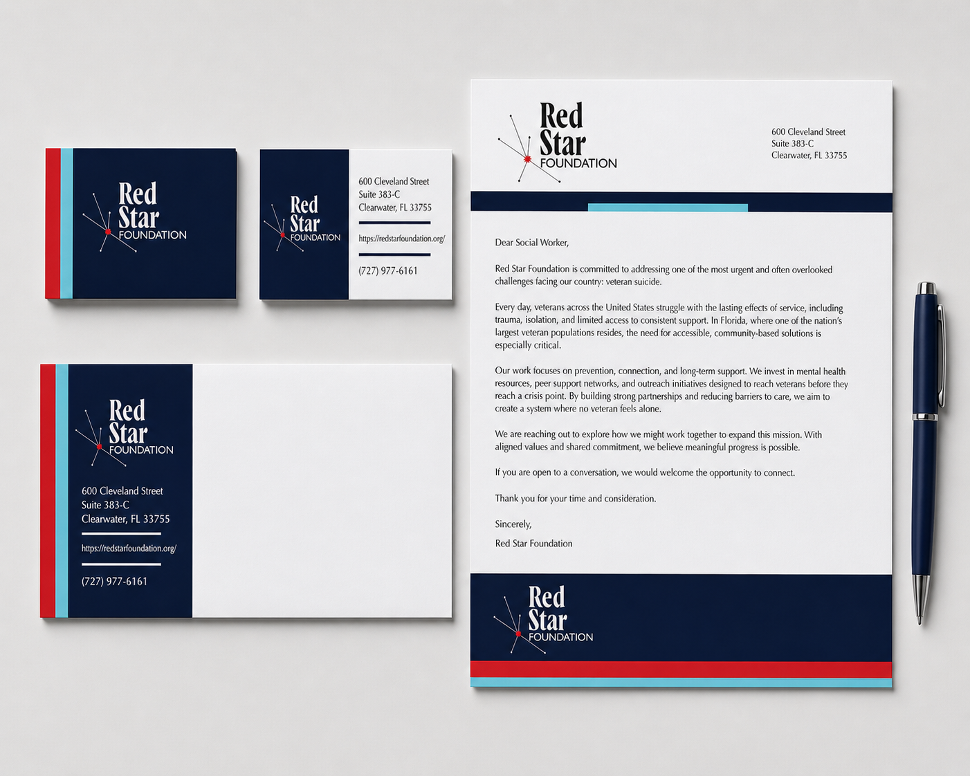
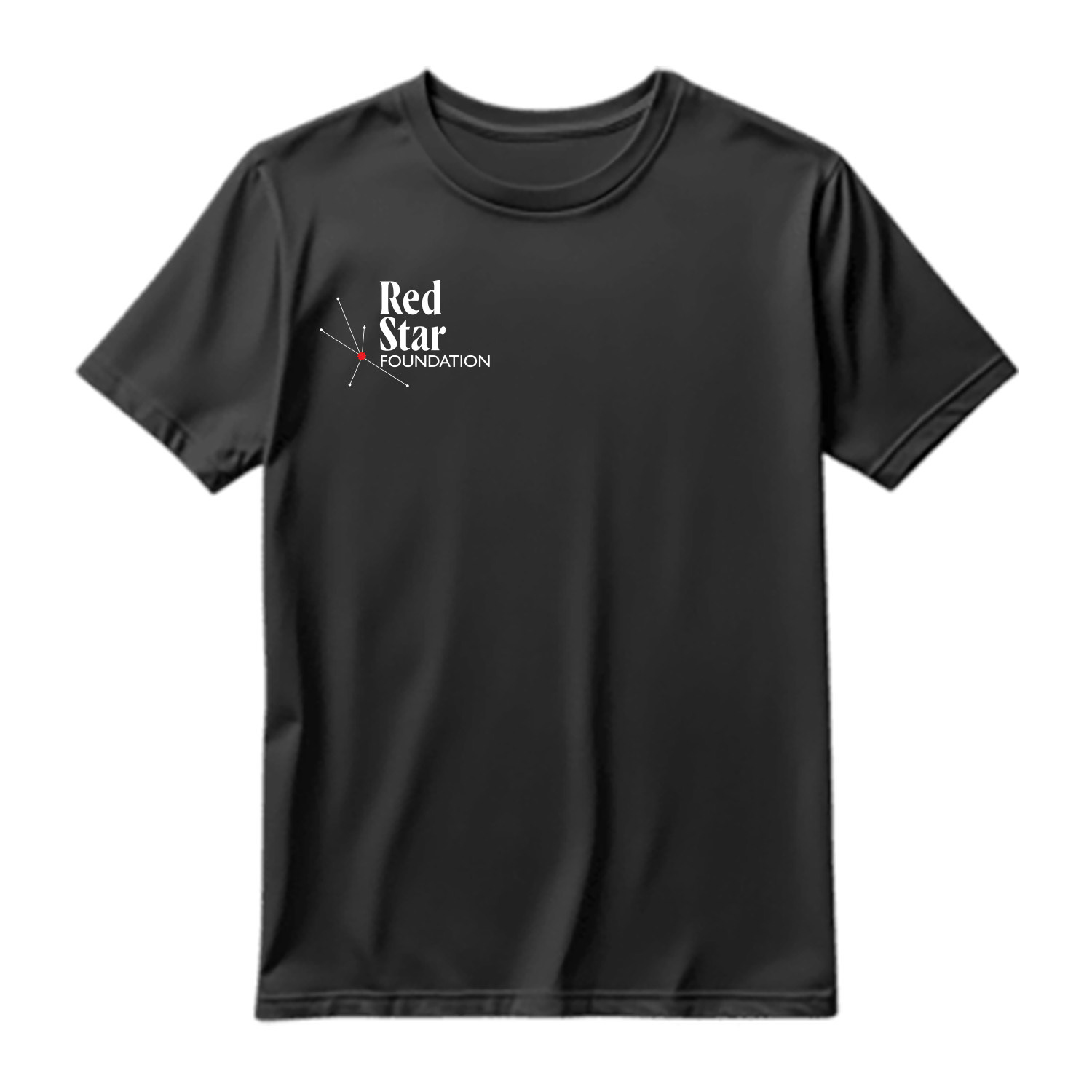
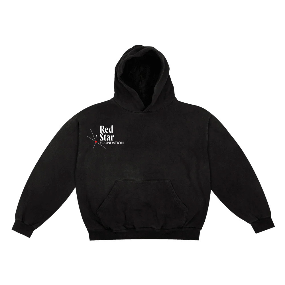
For my rebranding project, I focused on the Red Star Foundation, an organization dedicated to supporting veterans and addressing issues like suicide prevention. I wanted the visual identity to feel strong, respectful, and grounded without coming off as overly clinical or detached. I built a system that balances structure with emotion, using bold but minimal design elements, a refined color palette, and clear typography to communicate trust and stability. The goal was to create something that honors the seriousness of the mission while still feeling accessible and supportive to the people it serves.
What I found most interesting about this project was figuring out how to design with sensitivity while still making it visually compelling. Unlike more expressive or stylistic work, this required more restraint and intention behind every choice. I had to think about how branding can influence perception and build credibility, especially for a cause-driven organization. It pushed me to approach design more strategically, considering not just how things look but how they make people feel and respond.

Presentation Link:https://drive.google.com/file/d/1Y-AG7wdTGmSUNp3-BZ0V5l58Kq-g2THE/view?usp=sharing