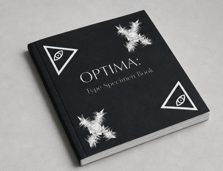
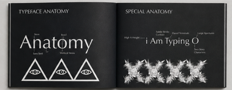
For my typeface specimen, I chose Optima and pushed it in a direction that contrasts with its usual clean, modern feel by giving it an eerie, gothic aesthetic. I focused on creating a mood that feels unsettling but still refined, using high contrast, negative space, and darker visual elements to shift how the typeface is typically perceived. Instead of treating it as neutral or corporate, I explored how its subtle flared strokes could feel almost haunting when placed in the right context. This project challenged me to reinterpret a familiar typeface and showed me how much atmosphere can be created through composition, spacing, and tone alone.